

Since the creation of ISIS in 2013, I witnessed as an Arab and Muslim citizen the bloody image of ISIS, and their strong media presence as well, and I observed the usage of type and calligraphy in their designs for social media and other outlets. In this post, I’ll show my findings* for ISIS designs and will comment on them.
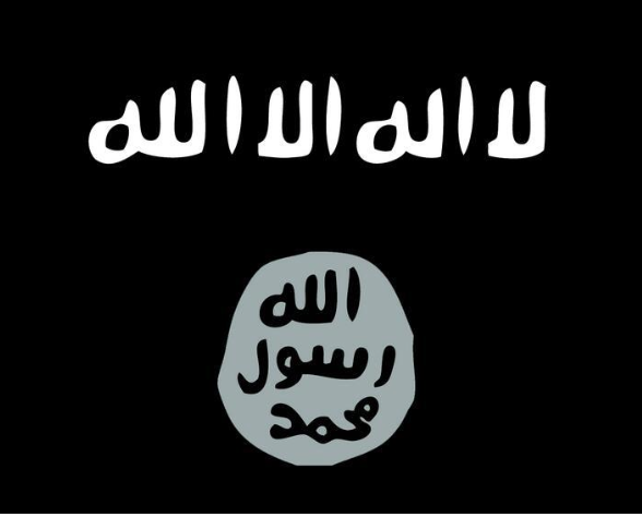
The official logo and flag of ISIS, which is the stamp of prophet Mohammad under the “Shahada” phrase that say: There is no god but Allah. The typographic style here is mimicking the stamp design in the 7th century, very basic, primitive and without any diacritic marks. ISIS used this design to declare their rights of “Khelafa” or caliphate. While in fact, the prophet Mohammad have not used his stamp as a war symbol, he used it as a personal stamp on messages to invite other rulers in the region to know about Islam. (We didn’t see the real stamp or its impression, the current known one is fake and was made by a Turkish artisan in the 19th century, the words’ order in the fake stamp above is wrong, Arabic words should stack over each other from top to down not the apposite)

The ISIS branding was seen in Bahrain, seeing this typographic design is a bad omen for anyone!

Here I’ll come to an interesting find, many of ISIS designs and publications is using a famous Arabic typeface, which is Al Jazeera channel corporate font.

Al Jazeera, that broadcast form Qatar, a contraventional TV channel and well-known world-class brand. As we see here their font is being used on their TV interface.

Al Jazeera channel’s font is being heavily used in ISIS designs, here it’s used as a caption on the first appearance of the caliph Ibrahim of ISIS

~ The Best Nation

Bilingual design, Using Al Jazeera font combined with a semi Futura font!

Breaking news style, very similar to Al Jazeera visual language

The other branch of ISIS in Libya, in this deign they are threatening to rise the ISIS flag over the coliseum in Rome! Using Al Jazeera font of course..

Here, we come a very interesting part of ISIS typographic study, which is the branding design for each state in the ISIS, I was impressed when I saw this for the first time, there is a serious effort has been made to create a typographic logo for every state!

Custom lettering for Al Khair state (Means the good) inspired from the Kufi Qairawani style with an intervention to enlarge the dot of Khaa, interesting and powerful!

Kerkuk logo, set in old Kufi Nesaburi style..

Diala and Nainawa states, in Sunbuli calligraphic style..

More logos for Al Furat, Al Raqqa and Aleppo states

Interesting design approach for Salah El Deen state (top right corner) that look like a ship, also Sinai and Al Janoob states

This photo was distributed on the internet claiming to be the official car plate of the ISIS, we see here the use of Ruqaa style in the design

Virtual mockup for the ISIS passport, using a computer Kufic font to reflect the grandness and the glory of the caliphate, and it say the following phrase: “The armies will be moved to carrier of the passport if any harm happened to him”

Intersting coin design of the ISIS, the face of each coin is using a computerize version of Thuluth script, and on the back there is a different illustrations and icons with Arabic/Hindi numerals set in Al Jazeera font again

English designs, ISIS famous magazine, and the usage of Trajan

Screen grab from a video of ISIS, where they demolish the borders between Syria and Iraq, the logotype of this campaign used a humanist sans serif font

A joyful script type over a condensed bold type, to celebrate the Eid occasion

Cyrillic script is presented here is well, since ISIS is targeting mercenaries from Eastern Europe and West Asia

Bilingual stenciled typography, the bridges in the English title is way better than the Arabic one

Despite of the consistency in brand implementation of ISIS, we still see some designs are off from the brand guidelines, here is Al Khair state logo is incorrect, and the design title is set in Luxor font of Diwan Software, UK!

And now, to the biggest surprise, my own font, Kharabeesh, which I designed as a comic and sarcastic typeface for the Kharabeesh network in 2011. I was really shocked to see it here, the font design purpose was to bring smile to people and to create sarcasm on the local affairs of the Arab world, the font was stolen of course, and it reached the ISIS designer’s computer somehow..

My Kharabeesh font a long with another Arabic typeface..
ISIS is definitely a nightmare, I hope it will be vanished soon, so people will gain their freedom and dignity, better than anytime before.
* Photos: different resources found on the internet

[…] https://alazaat.wordpress.com/2015/07/28/isis-typography/ […]
[…] https://alazaat.wordpress.com/2015/07/28/isis-typography/ […]